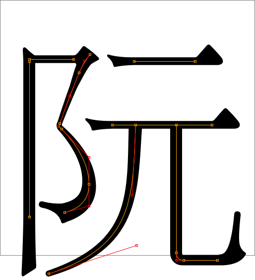
Finally, my thesis is completed and published! It is the product of work I did at Opera Software’s Beijing office last autumn and I have spent a lot of time writing the thesis report and preparing the final presentation. In short, I’ve implemented a fancy type of stroke fonts by building on well-known vector graphics concepts and modern web standards. This type of font is especially well suited for Chinese characters, which is one of the reasons why I wanted to work in the Beijing office. (Admittedly, the main reason is that I love Beijing.) I am very satisfied with the results.
Personally, I think the most interesting part is the stroking algorithm and its possible use in HTML 5 Canvas and SVG. However, web standards move slowly so it’s perhaps more likely it will be put to use in some other context first. Do read the report if you are interested in vector graphics and/or fonts.
Disclaimer: The views expressed are my own and not those of Opera Software.

Hey Philip you’re great !
I downloaded the PDF already.
It’s a subject I’m very interested in !
Thank you.
Tristan♥
I browsed through the paper, and it looks really good. Real sorry I missed your presentation. Congrats though. Meanwhile, enjoy Vietnam. We’ll just be fighting fascism back here, mm-kay.
What do you mean David by “we” and “fighting fascism” ?
Philip, your document is really interesting by the way !
I came across this blog whilst looking for fonts that are suitable for engraving. It appears that the leg work Philip has done is a great starting point for creating fonts suitable for engraving. I’ve downloaded the report to read in detail.
Engravers using diamond drag, or router tips, requires that the inside of letters be cut out. Stroke fonts do this, with the shortest number of lines too fill the letter. Closed contour fonts such as TrueType don’t. Closed contour fonts require software to fill the letter by contouring or hatching, both of which markedly increase the distance travelled and the number of tool ups, and/or have artifacts.
Thank you Philip for spending the weeks and months to look into this subject.